- September 26, 2025
- admin
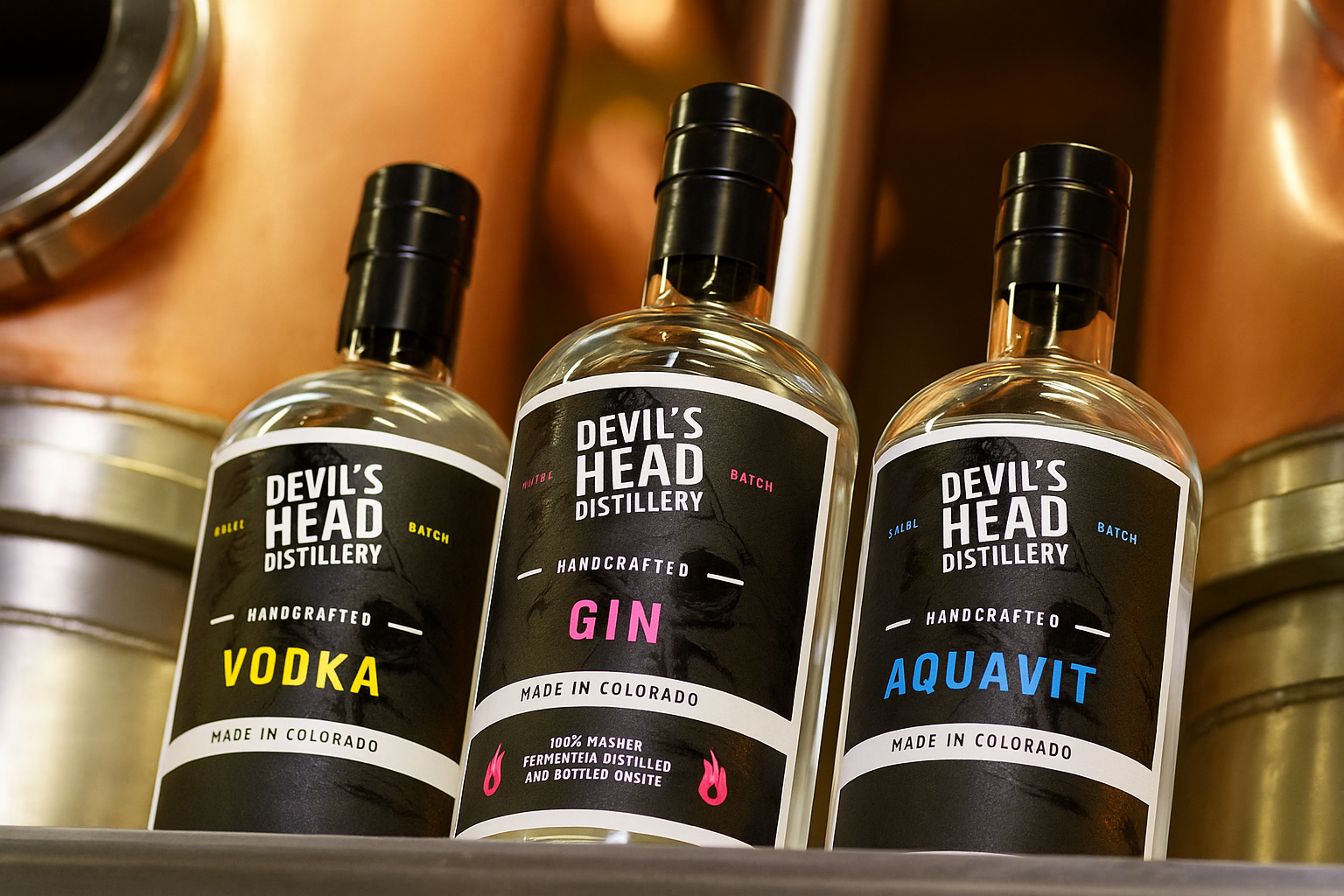
Imagine walking into a shop. You see dozens of bottles. What makes your bottle get picked up? Usually it’s the label. The spirit bottle labels, They speak before you taste.
When you are The Prakash Label, it is everything to be right with your spirit bottle labels and become one of them or shine through the crowd. Therefore, now we are going to discuss what good labels are, how to make them, and what the mistakes are.
Why Spirit Bottle Labels Matter a Lot
- First thing people see: Before a customer smells or tastes, they see the label. A clean, striking label can make them stop, read, and pick it up.
- Tells a story: Where was the spirit made? What is its character: smooth, bold, fruity? Your label carries all that. Good spirit bottle labels show the personality of the brand.
- Signals quality: A label that peels, fades, or looks cheap can make someone doubt what’s inside. If the spirit bottle labels are strong, they build trust.
- Must meet rules: You need to include things like alcohol content, volume, origin, and warnings. If your spirit bottle labels leave out required info, that can cause legal issues.
- Helps in a crowded market: There are many spirits. If your bottle labels are different in shape, material, or texture, people will remember your bottle, not just the flavour.
What to Think About Before You Design
Before you start designing your spirit bottle labels, ask:
- Who will buy your spirit? Someone who seeks luxury? Someone looking for craft/handmade?
- Where will bottles be seen? In bright stores, dim bars, online images? That affects colours and finish.
- Will bottles get wet or be cold (ice buckets, fridges)? That affects durability choices.
- Do you want finishes (foil, embossing) or a plain look? What feels like a match for your brand?
Key Things That Make Spirit Bottle Labels Great
Here are design and material choices that make your labels work well.
1. Material & Durability
- Plastic films (such as BOPP or PET) are waterproof, tough and durable. Good when the bottle is stored dry or in a cold place.
- Stocks on paper provide a better feel. Dilapidated, handcrafted, old world. Paper is more exposed to wetness and tears. Apply laminations or coatings.
2. Finish & Touch
- Other finishes should include matte, gloss, satin and soft-touch ones that influence the feel of the label in hand and its light reflectance.
- Embossing, foil stamping and spot varnish bring about visual interest. They render the spirit bottle labels high-quality. Cost is increased; legibility is to be maintained.
3. Typography & Colour
- The fonts must be in line with the brand style. Serif font type may be old-fashioned; clean sans-serif type is newer.
- Contrast is key. Dark writing on a light background or vice versa; therefore, valuable information can be read easily.
- Colour palette is to narrate the mood: warm colours with rich spirits, cold or clear colours with light ones.
4. Shape, Size & Layout
- Fit the bottle shape with the label shape. Wrap-around, different shapes, flat front, and curved bottles require various designs on the labels.
- The back label area can be used for more information: origin, tasting notes, story, QR codes, etc.
5. Story & Branding
- What is different about your spirit? Local ingredients? Heritage? Unique process? Get that story printed on your spirit bottle labels.
- Design must not conflict with the rest of your branding: website, packaging, promotional materials. When the individuals identify with your label, they identify with your brand.
6. Trend Awareness
- The growing number of brands is seeking environmentally friendly label materials: biodegradable films, recycled paper. Consumers care.
- Minimalism is enormous: less design, light structure, large font. It assists labels to stand out in the midst of a crowd.
- Smart tags or interactive functions such as QR codes or NFC are on the increase. They allow you to relate to buyers other than the bottle.
Mistakes to Avoid When Making Spirit Bottle Labels
- Putting too much text or too many tiny details. If someone needs a magnifier, that’s bad.
- Using finishes that hurt readability (e.g., gold foil over a busy background) or that reflect so much light that it washes out the text.
- Choosing poor materials: labels that peel, fade, or wrinkle when wet.
- Design not matching the bottle shape (the label creases or lifts).
- Forgetting legal and regulatory info or putting it too small or in a place no one sees.
How The Prakash Label Can Do It Right
Here are the steps your team can follow to get spirit bottle labels that work well.
- Define your brand voice & story – What’s special about your spirit? Your heritage, taste, and audience. Be clear about that.
- Choose materials early – Before designing, decide if you want paper or film, waterproof or not. That frames the rest of the design.
- Sketch mockups & test – Print prototypes. Apply them to bottles. See how they look in light, under moisture, in a store-shelf setting.
- Work with good printer partners – Someone who understands finish, adhesives, and die-cuts. They help avoid problems.
- Balance cost & value – Premium finishes cost more. Decide what level of finish brings enough value to justify the cost.
- Comply with all rules – Alcohol %, net volume, origin, and any required warnings. Check local laws.
What’s Changing & What’s Hot Right Now
- More sustainable & recycled label materials are becoming common. Brands want to show they care for the environment.
- Minimal designs & clean typography are in. Cluttered labels are less popular. Buyers appreciate clarity.
- Touch & feel: textured papers, embossing, foil, spot UV, etc. to make labels feel special.
- Interactive elements: though not every brand needs them, QR codes or digital content on or linked from labels are gaining attention.
Conclusion
Spirit bottle labels are more than just stickers on glass. They’re your brand’s handshake, your first chance to speak with a buyer. When The Prakash Label Private Limited gives care to design, material, finish, and story, the labels won’t just look nice; they’ll work hard. They’ll draw attention, build trust, and help people remember your brand.
If you focus on choosing the right material, making designs clear and appealing, and avoiding common mistakes, your spirit bottle labels will be something customers pick up with confidence. In the end, good labels help good spirits find their place.
FAQs
Depending on the country, but usually you require: brand name, type/class (whiskey, gin, etc.), alcohol by volume, net content/volume, origin, name/address of bottler or manufacturer and warning labels where needed. Always check local laws.
Synthetic films like BOPP or PET are good. Waterproof coatings and laminates help. Adhesives that stay strong in damp conditions matter. Paper stocks may need special coating if used in wet conditions.
Yes, they often do. These finishes make labels catch attention, feel more premium, and give tactile appeal. But they cost more and sometimes slow down production. Also, they should not harm readability.
Recycled or FSC certified papers, biodegradable films, water-based inks and minimum packaging around the bottle are used. You can also consider simpler finishes, which require fewer chemicals. And you can demonstrate the sustainability story on the product or through QR codes.